

Last week I wrote about allowing students to analyze data for themselves. But we cannot address data analysis without discussing how to represent data and communicate it clearly using graphs. Similar to the data analysis process, we usually tell students how to create a graph, but rarely let them try, and fail, to make an appropriate graph for themselves. This week, we’ll address how to teach students to make appropriate choices when it comes to creating graphs. Once again, I’m drawing on information and inspiration from Diane Johnson’s talk at the NSTA Engage 2020 virtual conference.
Graphs as communication
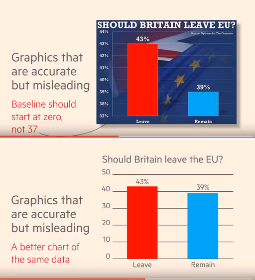
Graphing is one of my favorite topics to teach to my pre-service teachers. I start with example graphs and let them critique by first asking what the graph is trying to communicate. I give at least one example that is intentionally misleading. Often this is with a descending y-axis so the data appears reversed, a y-axis that is only showing a small portion of the total number so differences are inflated, or an x-axis with irregular intervals. Showing these intentionally misleading graphs helps students understand that the purpose of a graph is to communicate. It is possible to represent the same data in different ways that could lead the reader to different conclusions.
I’ll also provide students with graphs that are not misleading, but may be challenging to interpret. My favorites are weather graphs which tend to look quite complicated at a glance. The purpose of these graphs are to give information like daily temperature data over the course of a year. It takes time to decipher and interpret these graphs as their purpose is to inform. Giving students examples that are misleading and that appear overly complicated helps them to better understand what a good graph looks like with axis labels and scales, data points, and a clear purpose for communication.
While high school and college students who have had several years of experience with graphing, they may still struggle with how to decipher and interpret graphs. For those students, start with the BSCS I2 strategy. Students first Identify changes, trends, or differences by answering the question “what do I see?” Then students Interpret what they see by answering the question “what does this mean?” To assess students’ skill of interpreting graphs, in the third step of this strategy, they are asked to write a caption to explain what they see and what it means. When students are able to read and interpret graphs with competence and distinguish good graphs from poor graphs, then they are ready to design their own graphs from datasets.
Types of data
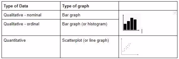
When preparing a graph, the first thing is to identify the type of data as this will determine the types of graphs that are possible. There are two basic types of data: quantitative and qualitative. Quantitative data pertains to quantity and are counts or measurements. Qualitative pertains to quality and is represented as words or categories. Qualitative data can be nominal where the data are names and can be placed in any order without jeopardizing the integrity of the dataset or ordinal where there is an order to the names. Examples of ordinal data include level of education or income brackets.
You have likely experienced other terms for describing data like categorical, continuous, ratio, or interval. I’ve purposely kept the categories of data here to three types to make it easier when you are teaching students how to graph. Advanced students will need to know that different fields of study have different conventions for describing types of data. A blog by Statistics by Jim explains types of data and how to graph them in statistics. Far down in the comments he has a very good explanation of these different data types in response to a comment by Chuck. If you want further clarity on terminology to describe data, I recommend taking a look.
Matching graphs and data
Being able to distinguish between quantitative and qualitative data is the first step towards figuring out what kind of graph to use. It is also important to remember that every set of data represents a variable in an experiment. Ultimately, with graphing, you are trying to depict relationships between variables or differences between groups.
At its most basic, there are two types of graphs that scientists use: a bar graph and a scatterplot. If one of your variables is qualitative, then a bar graph must be used. With nominal data, the order of the data points is not important and can be moved without losing the integrity of the data meaning. When you have two quantitative variables, the datapoints are plotted on a coordinate creating a scatterplot. If students know this basic rule, then they can create other types of graphs while faithfully representing the data.
There are many other types of graphs than just bar graph and scatterplot, anywhere from 3 to 44 according to a quick Google search for ‘types of graphs’ but these are the two universal types of graphs that are commonly used across all areas of science. If students know nothing else about how to graph data, they should know when and how to use a bar graph versus a scatterplot. Other common types of data representation worth mentioning here are the histogram, line graph, pie chart, and box-and-whisker plot.
Histograms are popular in biology and statistics. These are bar graphs where one set of quantitative data is put into categories making the data ordinal rather than truly quantitative. The bars touch one another and can show relationships between categories and quantities without the image being overwhelmed with datapoints.
Line graphs should be used with extreme caution when working with students. The only time it is appropriate to use a line graph, with datapoints connected by lines, is when the intervals between datapoints for one quantitative variable is regular, like time. In physics, line graphs are used for position versus time when teaching speed and acceleration.
“The purpose of a graph is to communicate.”
Scientists rarely use pie charts, which should be reserved for depicting percentages and are more common in business or sometimes social sciences. Box plots or box-and-whisker plots likewise are rarely used in science, rather are reserved for statistical analyses with data represented in quartiles. I mention these two types of data representation because they are commonly used to represent educational data. However, in science, students rarely need to use pie charts or box plots to represent their data.
Teaching students these basic rules for representing data in science gives them a foundation for making informed choices on how to faithfully represent their own datasets in graphical forms, allowing for clear communication of data.

Show students examples of poor graphs as well as good ones so they can identify quality and purpose. Keep it simple by teaching students to create bar graphs and scatterplots before going into field-dependent conventions of graphing.


